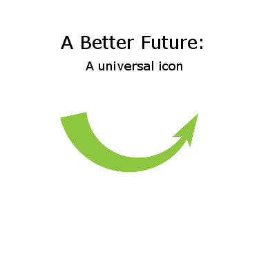

The Arrow
How can we describe a complex social movement for a better future? The solution: a simple icon.
 In 2007, ecologist Paul Hawken wrote “Blessed Unrest: How the Largest Movement in the World Came into Being, and Why No One Saw It Coming.” In it, he describes how the actions of people all across the world are all connected within a common commitment to creating a better world. The book spawned a website, wiser.org (now defunct) which attempted to connect all organizations around the world through a single website platform.
Hawken’s work helped me understand the combined strength of social movements, and the importance of linking various causes together, be it through identifying co-benefits or through a deeper common cause.
One of the challenges of building a united movement is to find a way to convey the common cause and commitment that lies at the heart of so many issues and solutions. How, for example, can you connect the work of a community group in Udaipur, India with the local green group in Parkdale, Toronto, both of which are actively running projects for local food and community economic development? Or how can you connect the work of dozens of organizations within each urban neighourhood?
 Where words fail, or become too complex, a simple image will do the job. We all know the recycling logo, which has become one of the best known environmental icons worldwide, but is limited to a single issue. My solution was to design a similar icon that would reflect the common commitment to a better future and the ability to turn problems and downward trends into positive solutions.
In my position as Executive Director of the Conservation Council of Ontario, I contacted a graphic designer, Gil Martinez of Big Guy Studio. This is what Gil came up with, and it has been registered under a Creative Commons license as a free image to be adapted and adopted freely:

You can find more information and download artwork at the Canada Conserves site. These are some of the adaptations I have used in my own work:


